PRODUCT DESIGN - GROWTH
Increasing Payment-Ready Customers with Simplified Customer Onboarding
Led the design revamp of the Customer Onboarding experience to increase engagement and regional customers’ readiness for accepting and sending payments across South-East Asia (SEA). This project was shipped in Dec 2023 and I worked with one product designer and UX writer for the redesign.
ROLE
Design Lead / Manager at Xendit
SCOPE
Problem Scoping + Approach
Product Strategy
User Journeys
Interaction Design
Research Planning + Execution
TIMEFRAME
Nov - Dec 2023
THE GOAL 🎯
“How might we simplify the customer onboarding experience for regional customers?”
Overview
This redesign was aimed at simplifying the onboarding journey from customer sign-up to 1st transaction to make it easier for regional customers to be payments-ready in their chosen markets while achieving the business goals of acquiring and retaining customers.
Problem
The closed, labyrinthine regulatory landscape makes the onboarding process to use payments painful for customers that want to do business regionally in SEA. This is also challenging for Xendit internal operations teams as knowledge was localised rather than regional-focused.
Lack of regulatory clarity and transparency
Each country has its own regulations, often closed and bureaucratic.
Fragmented regional ecosystem
Regional customers have to onboard multiple times, undergoing KYC repeatedly to use payments in different countries.
Operational burden
Manual collection and verification of KYC documents limits Xendit from onboarding more customers.
Success Metric
We chose to focus on the steps in the funnel we could control and impact, eliminating metrics that were highly dependent on our payment channel partner approval speeds.
Research + Insights
Fact Finding
Key insights were gathered via the evaluation of current sources of data available through our data dashboards, customer tickets and prior user research from talking to our customers and usability testings.
Key Insights
Past efforts to improve the user experience were driven by localised regulatory needs and tended to focus on isolated parts of the onboarding journey.
There were three key insights with the current state of onboarding flow:
User Pain Points
Xendit Internal Teams
Account Managers, KYC & Customer Success Teams
Operational inefficiency due to manual work that can be automated
Resolving customer tickets related to onboarding that can be solved with clearer guidelines, copy and better UX
Helping customers with manual account creation and documents upload
Regional Businesses
Enterprises, SMEs
Productivity loss from time wasted on submission of documentation for KYC
Creation of multiple accounts per market
Repeat submission of documents and information
Misleading expectations as enabling of payment Channels happens after account activation and KYC
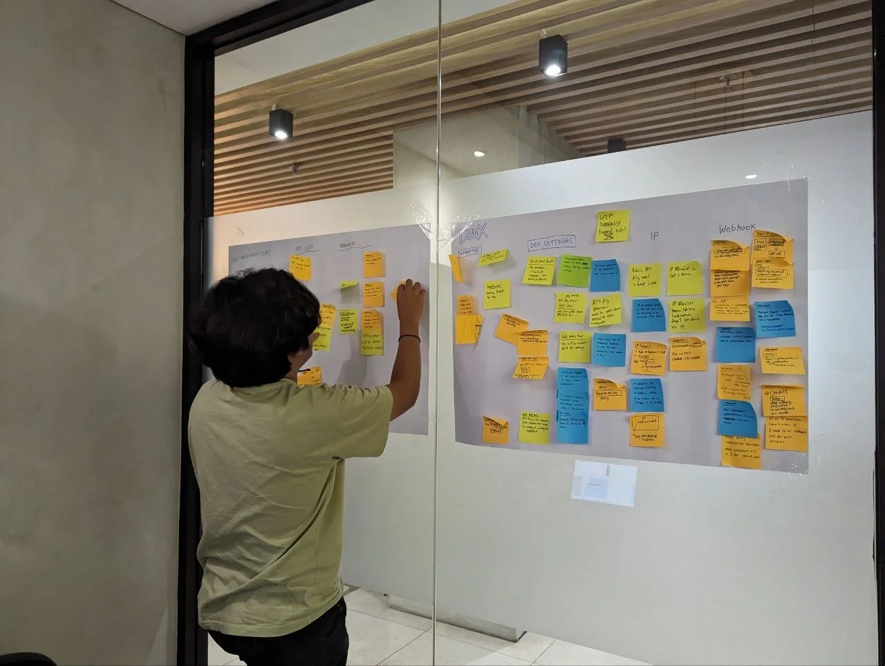
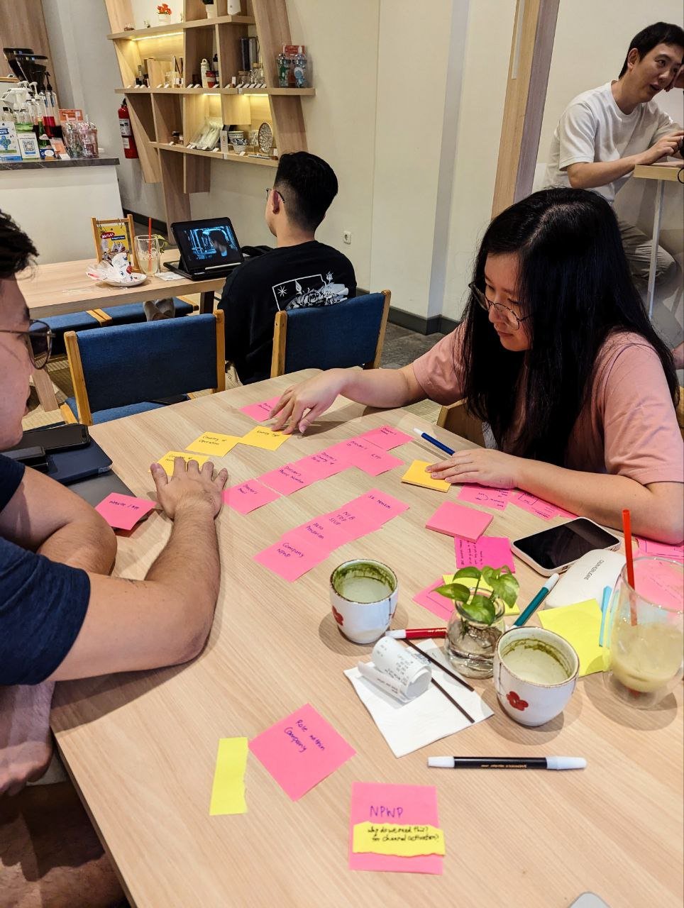
Above: We brought our work from the office to lunches and dinners outside and even to the hotel accommodation to meet the tight deadline.
Design Approach
With a tight timeline for design delivery, I worked with our designer and UX writer to scope out the design timeline and run a 1-week Design Sprint. This allowed us to come up with a first good concept we could then test and iterate with stakeholders and customers.
Defining Design Principles
I approached the problem by going back to the drawing board, starting by redefining principles for the onboarding redesign to focus on providing users with the following:
Segmenting Customers by Intent
I also wanted the team to segment the types of customers who come through the flow based on intent so we could understand what their journeys and what success looks like.
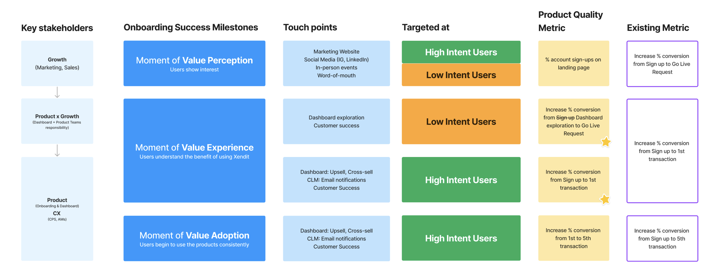
Ecosystem Mapping
Given that Onboarding involves so many different stakeholders, it was essential to map stakeholders, touch points for users, define onboarding success milestones for users, as well as define business success metrics.
This enabled us to have clarity across the entire funnel to know where to best focus our efforts as product designers, and what activities were best left to other stakeholders to work effectively.
Mapping the Ideal User Journey
We then mapped the ideal user journey for our customers, looking at ways to simplify and accommodate the flow for high intent users who were focused on getting their accounts payment-ready as quickly as possible to process payments.
Results
Based on concept testing with customers and stakeholder feedback, we tweaked the new design for development in phases, starting with the Onboarding Wizard.
General Onboarding Flow
Payment Channel Activation was moved up in the flow to better align with user expectations.
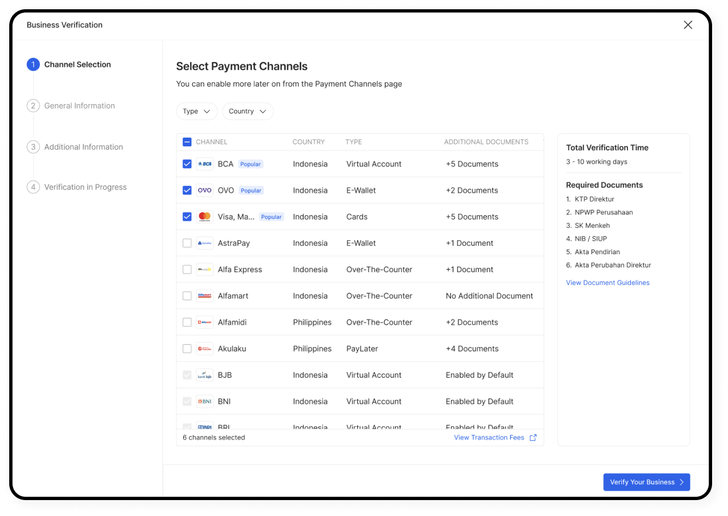
Channel Activation Selection
Providing users with a new page showing a full selection of available payment channels eligible to them made channels more discoverable, while also helping to manage their expectations for required documents to submit.
We also expected this to reduce CS tickets, reducing operational burden on Xendit.
Onboarding Wizard Screens
The before and after screens for the new Onboarding Wizard was designed to help users focus on completing the forms rather than distracting users to explore other parts of the Dashboard. More guidance was also given for document guidelines to help increase their success rates.
Impact
By resolving usability issues and a refreshed design, we saw a significant improvement to our metrics in the 3 months post-launch after controlling for holiday-related dips and spikes.
42% lift
in conversions from Account Sign-Up to Go-Live Requests
200% increase
in conversions from Go-Live Requests to Go-Live
Next Steps
We were able to ship and deliver the immediate design changes with improved conversion metrics and fewer drop offs. However, to deliver the ideal vision of accessing all markets with just one onboarding, there was more to be done.
Future improvements
Develop better personalisation for customers, with a single onboarding to access all markets
In an ideal scenario, our onboarding would determine customer preferences and recommend the right payment products (for different markets) to suit their use case and hence removing the need for an exhaustive KYC process.
Improve usability and accessibility
Conduct research with a larger sample of customers (both Enterprises & SMEs) post-development. Admittedly there was not a strong focus on accessibility in the first new version that was shipped.
Balancing risk with ease of use
To further reduce the friction of the lengthy KYC process, we required more consultation and negotiation with stakeholders like our Compliance and Risk teams.
Key Learnings
1. Leverage executive backing to fast-track key projects
Design revamps with executive backing and when time-boxed, can lead to faster turnaround times and effective results.
2. Single-threaded focus on high priority projects
Given the time sensitivity, I made the decision to take our UX writer and designer off other projects to fully focus on designing, validating and iterating quickly.
There was bound to be people who would feel upset and this required negotiation with other PMs for projects they were handling to help them understand the urgency for prioritizing this project and the common goals we had for happy users and a thriving business.


